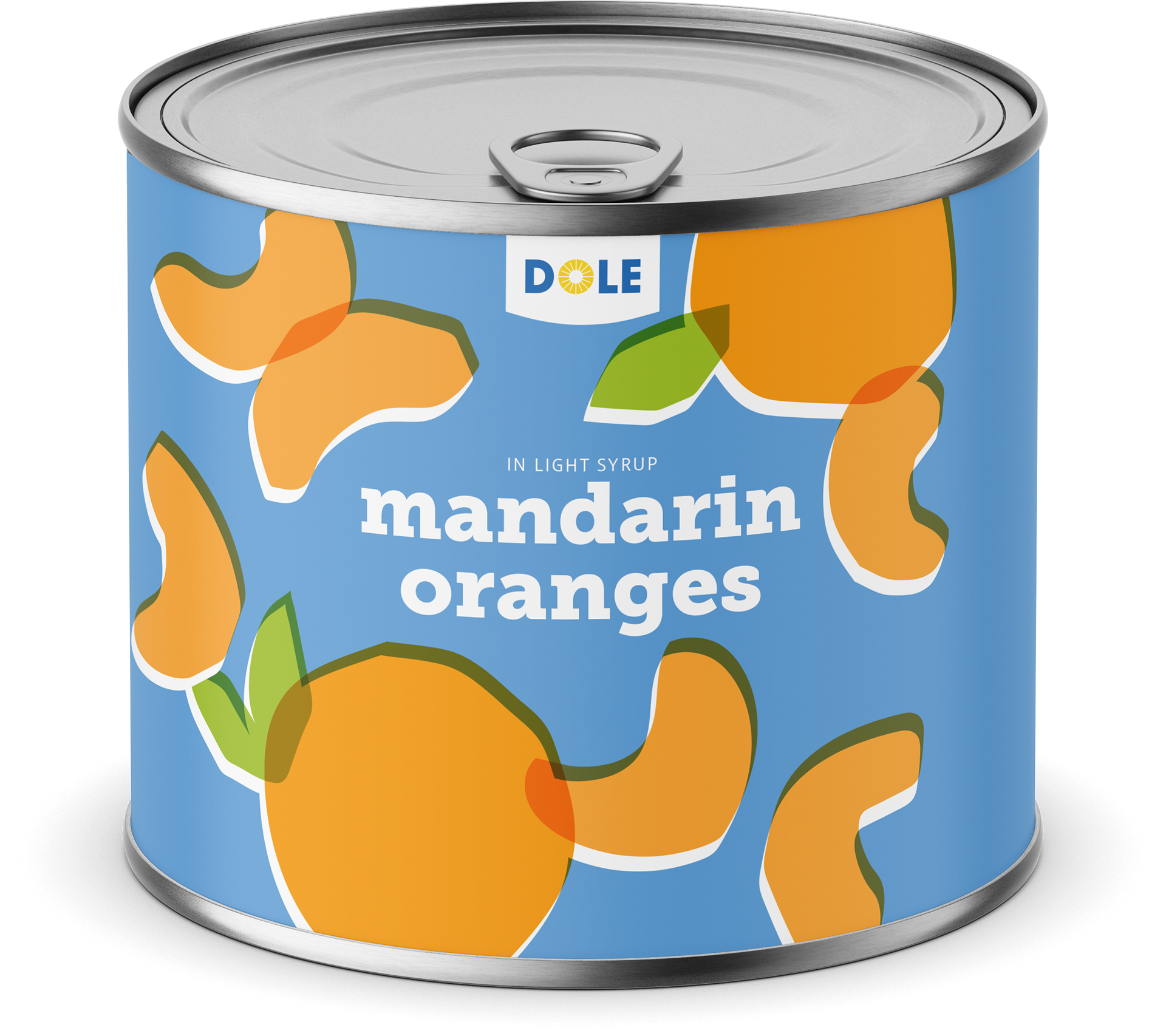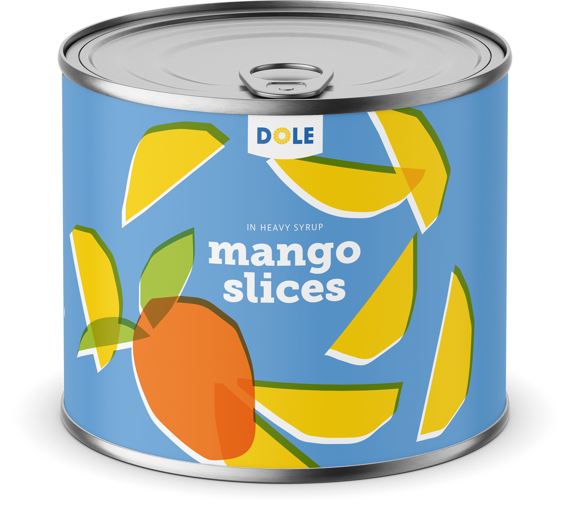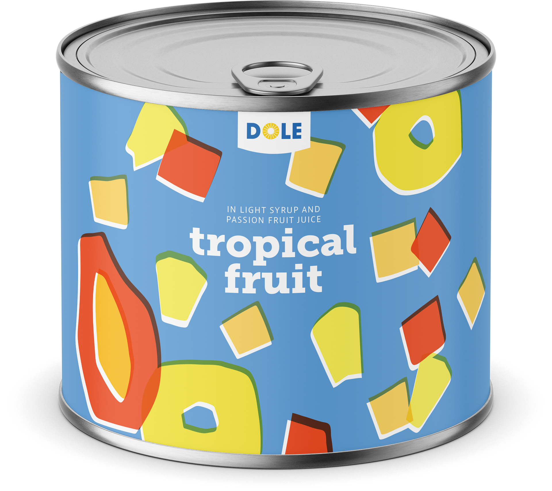

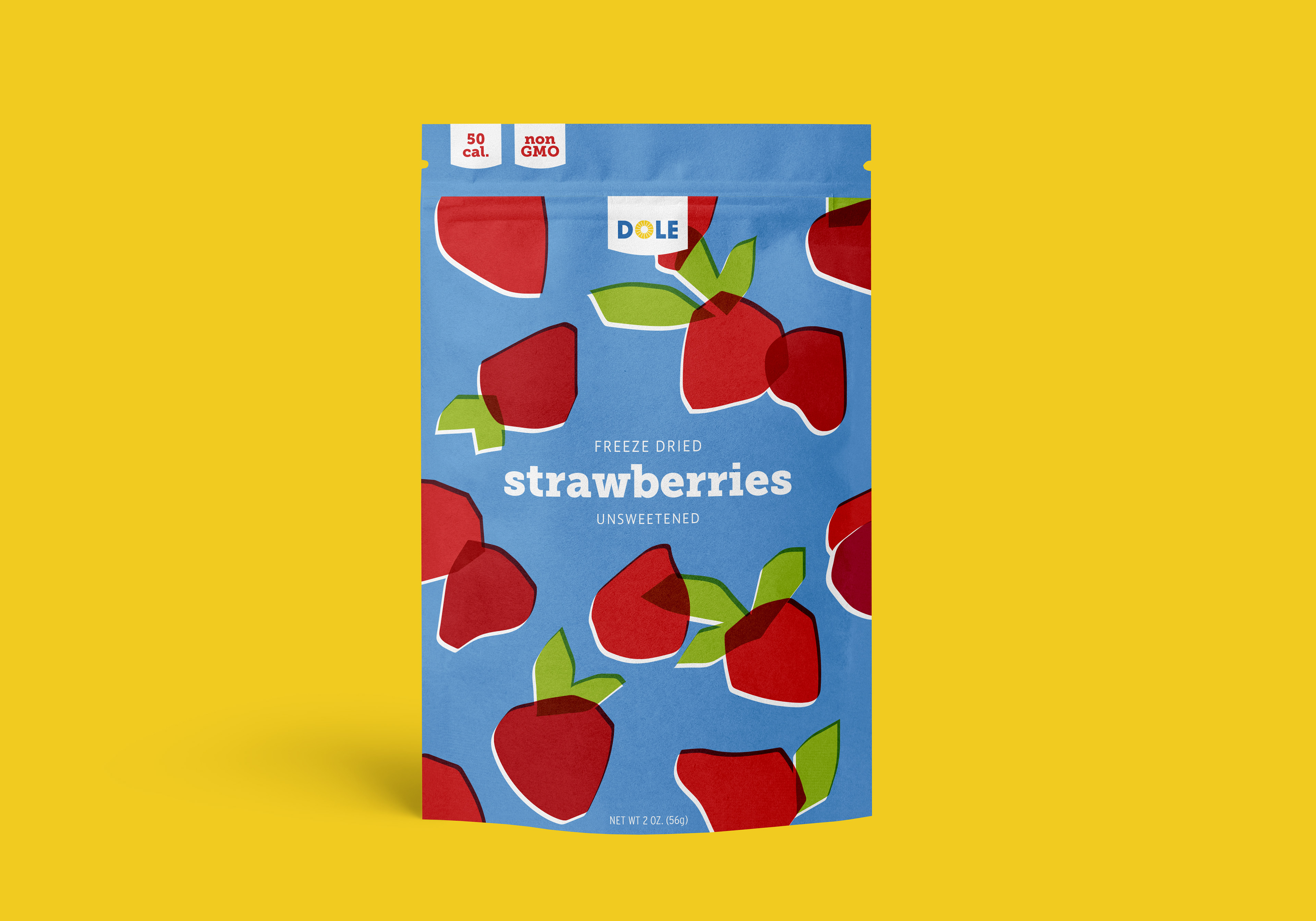
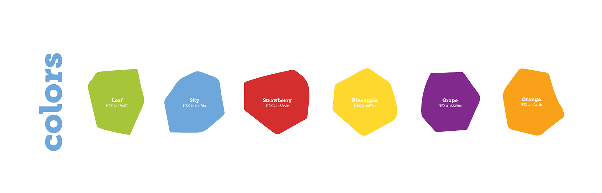
Dole has promised a brigther world and is working towards making a difference within their production. It’s only appropriate that their packaging takes on a similar brightness. This redesign use of a rich color palette and a paper cut style to evoke freshness. The hope of this new packaging is to bring a smile to everones face with our products.
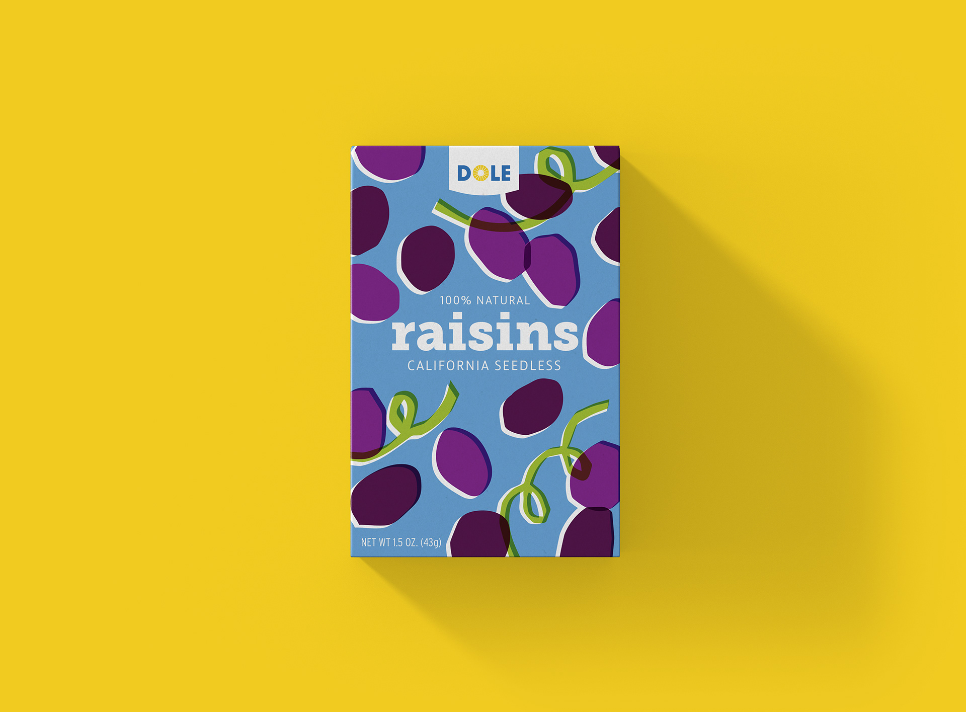
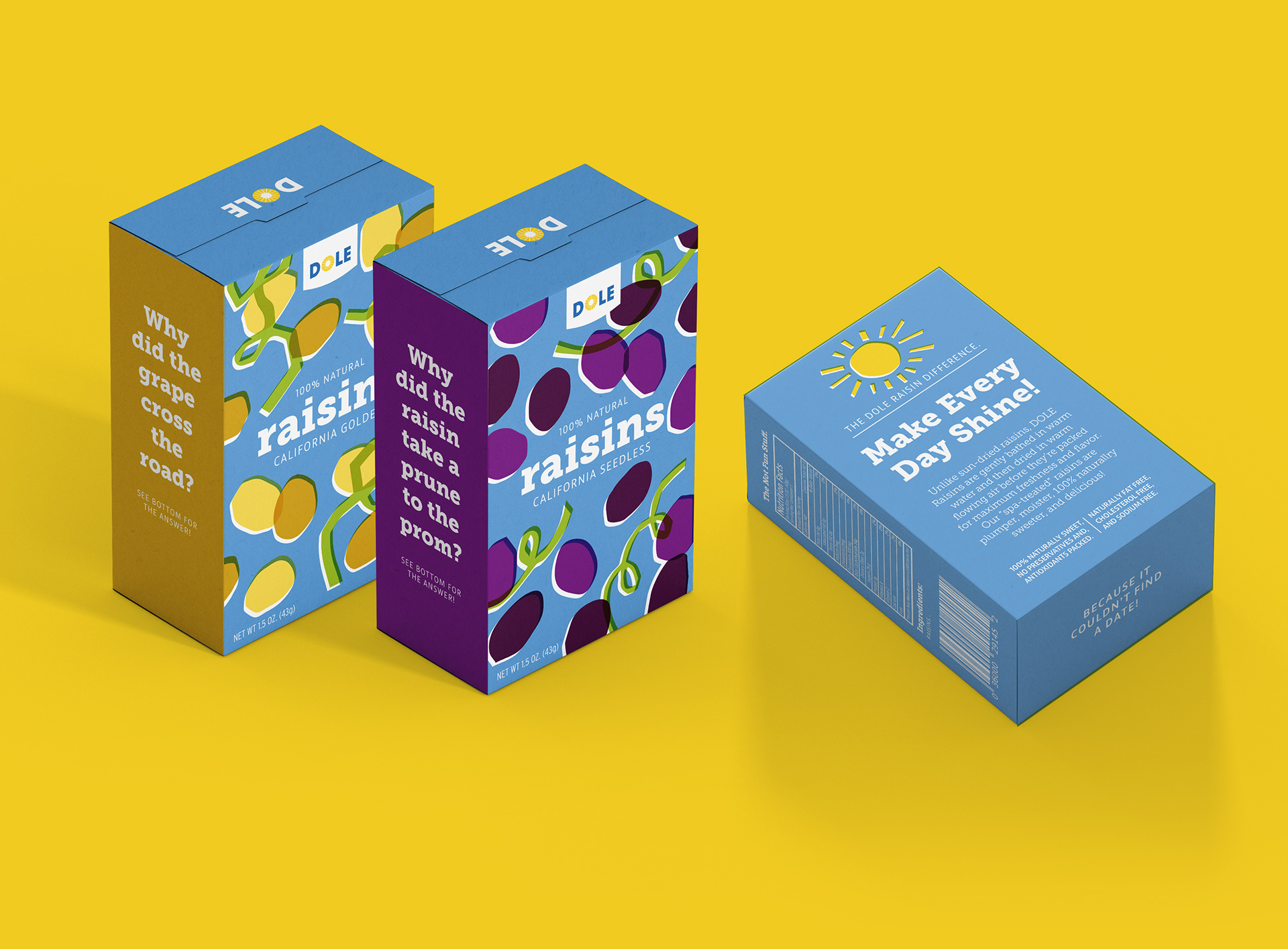
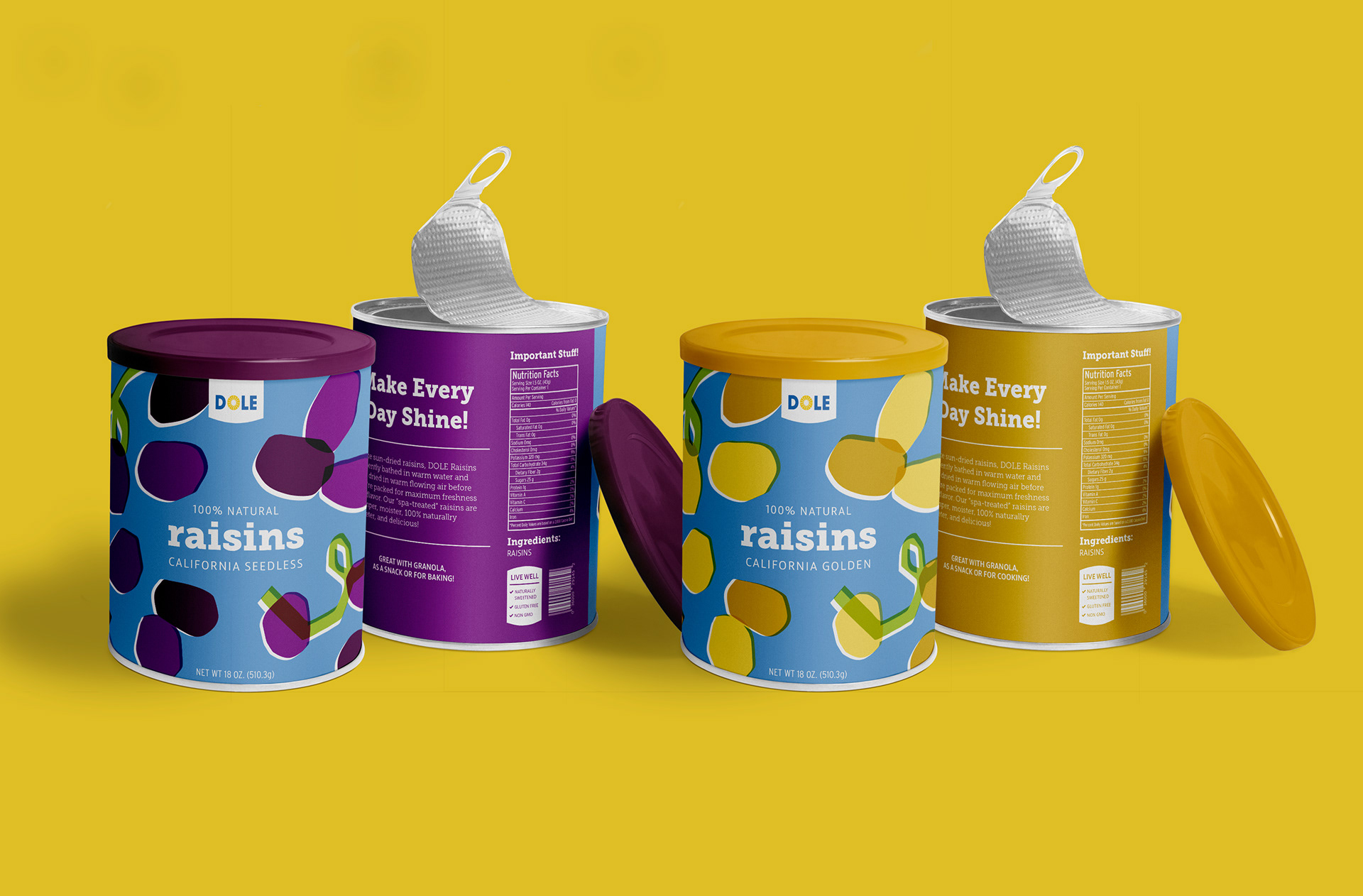
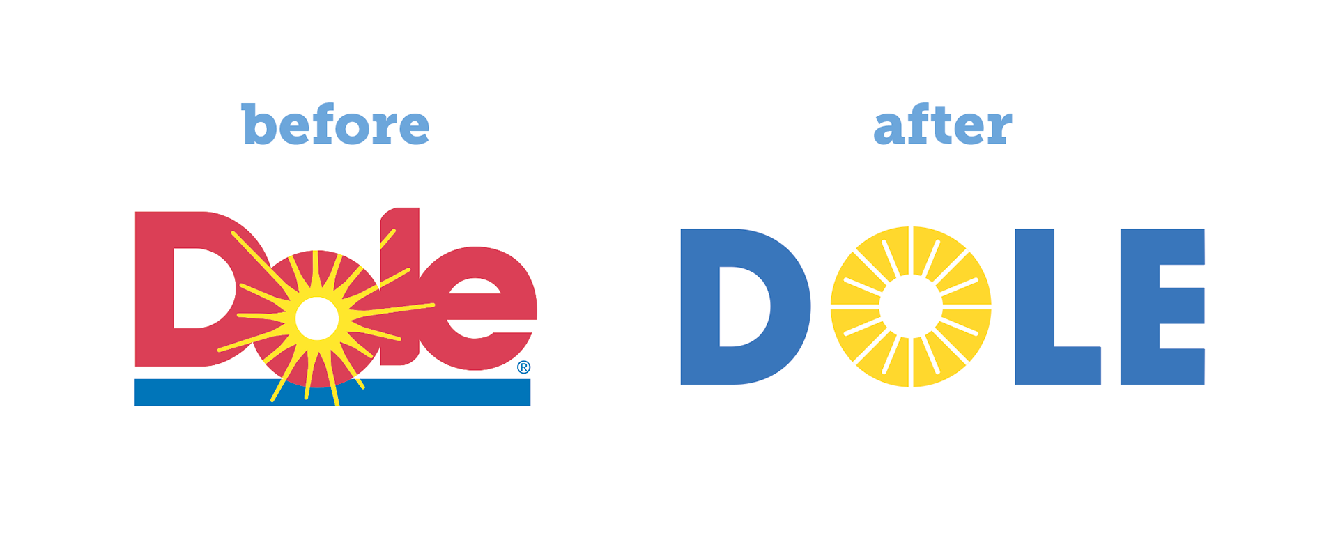
The goal when designing this new logo was to maintain the original essence of Dole while still giving it a new freshness. The mono-weight sans-serif, Gibson, added with the O in the center that has elements of both the sun and pineapples make it feel modern but still friendly.


Since our humble, yet mission-driven beginnings almost 170 years ago, Dole has believed that good, healthy food should be more like sunshine – available for all. This is why our rallying cry of “Sunshine for All” is important not only for us, but for all people across the world. We want to champion an equitable world where everyone – irrespective of age, income, location, race or gender – has access to healthy nutrition, but where this access does not come at the cost of the planet.